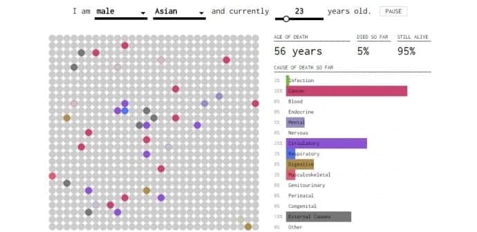
As Yau clarifies on theFlowing Data site:
put in your sex, race, and age.
Color corresponds to cause of death, and the bars on the right keep track of the cumulative percentages.
By the end, youre left with the chances that you will die of each cause.

To get more details on Yaus insights, clickhere.

source: www.techworm.net